"I don’t know how one goes about finding these things, but someone noticed a w..."
"
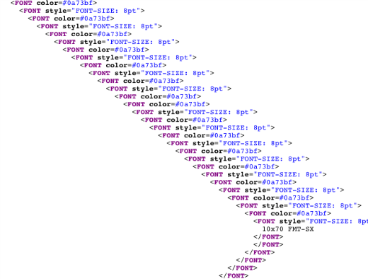
I don’t know how one goes about finding these things, but someone noticed a weird source code for this page. It’s a very basic, unspectacular catalog page for Fujinon Binoculars. But take a look at the source code.

This screenshot is but a tiny part of the madness. Keep scrolling down the code for the full effect. I’ll wait. Apparently, the designer cares very deeply about the 8 point font. It was funny enough to get posted to b3ta and even made the weekly newsletter. Lots of folks laughed at it because it seemed so pointless. But that’s just the beginning of the story.

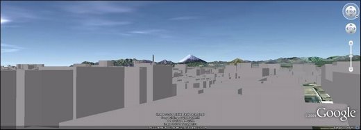
Which doesn’t mean anything in itself, but take a look at the Google Earth view from Fujinon’s headquarters as you look toward Mount Fuji, as posted to b3ta.

And then overlay the source code (seen in yellow here) onto the image.

Just a bit of an “ooga-booga” moment, huh? But it makes plenty of sense in the Japanese “form over function” mindset. A website has to have the proper Feng Shui after all. When you take all day to make sure one stroke of your calligraphy is right, why not go the distance for your html as well?
"