Brilliant Dirt Poster
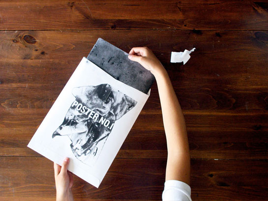
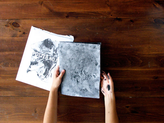
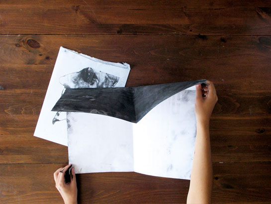
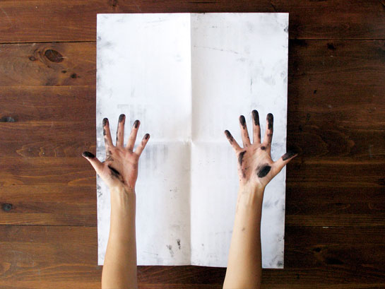
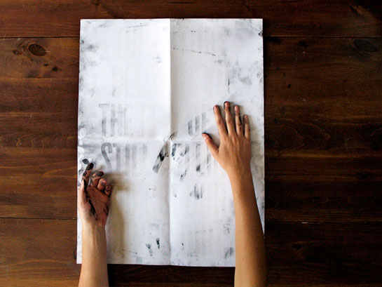
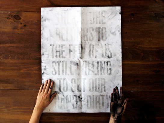
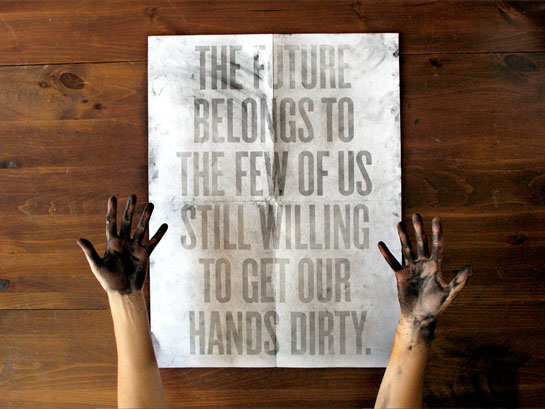
I’ve seen this image floating around the internet but didn’t know that it was more then a cool poster but a brilliant conceptual designed posted. The designer (Roland Tiangco) describes it: “A poster the recipient completes by revealing spot-varnished type with hands made dirty by handling the poster. This is the first of a series of posters.” I love smart design so much, designs with no concept are so boring and sadly so common.
(via oscarzabala)
